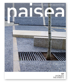
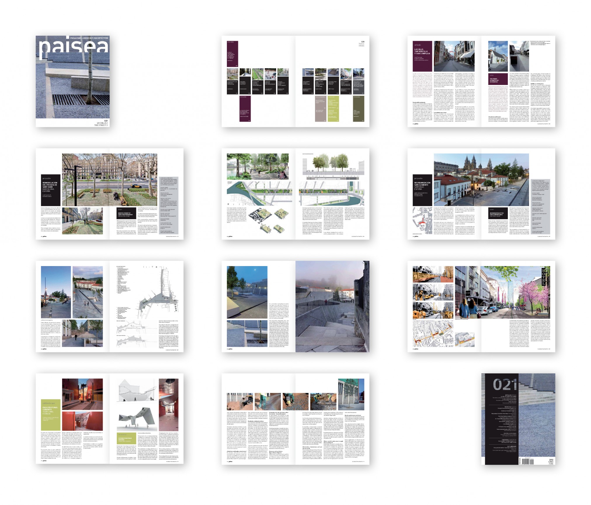
Now on sale the new issue of paisea 021 the street 2. And with this we release the paisea new image. Here’s a sample.
Since its first issue over 5 years ago, paisea has left its design almost entirely unchanged. With this experience in mind, we have decided to make a number of changes which we are sure our readers will appreciate.
In addition to a new front cover with more photographic space, the redesign has three main objectives: a simplified structure which is easier for the reader to follow, improved text readability, and more prominent pictures.
We have therefore designed a layout which is structured along a horizontal line running across a two-page spread, using a landscape architecture metaphor. Textual content dominates below this line, while the space above it is devoted to pictures.
Also, the Spanish and English texts now have a clearly different typography, but the same size and contrast. We hope you will enjoy the new paisea.
[issuu layout=http%3A%2F%2Fskin.issuu.com%2Fv%2Fdark%2Flayout.xml showflipbtn=true autoflip=true autofliptime=9000 documentid=120606163219-c9283d4038c54a568df0805850e27c1e docname=nueva_imagen_paisea_021_la_calle_2 username=paisea loadinginfotext=nueva%20imagen%20paisea%20-%20021%20la%20calle%202 showhtmllink=false tag=la%20calle%202 width=430 height=272 unit=px]
For the preview click digital edition preview and purchase the digital edition or the paper edition. Click on the cover to see the index of the issue.


